
Candice tells how she creates for Cambridge United
- Aug 27, 2018
- 3 min read


This month I started to create for the new season of Cambridge United Football Club. I am very excited to have the opportunity to play with the team´s colours - white, yellow and black - though it is not easy to find black flowers out there, so other elements can also help.
Like for other clients, the first thing I do is to visit the room I will decorate. At the hospitality area of the club I had the reception area desk and the exclusive rooms, including the Boardroom. The latest are round tables with a black table cloth and yellow napkins that give me a basis to work with. The black table cloth will always ask for light colours to be in contrast with the black.


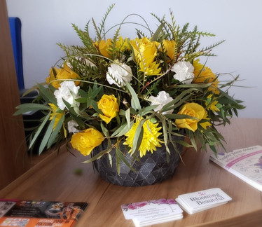
For one of the matches I have used the yellow and the gold that create a splash of light in the centre of the tables. The vase was decorated with yellow pearls at the bottom and sprayed with an antigue gold at the top. That brought contrast with the black table cloth at the base and the light green foliage at the top of the vase.


For another I did a low design with the same colours but the gold was used this time on two hydrangea leaves at the sides of the design. It is lovely to have that nice black cloth on the table with the yellow name badges and napkins and references to the team colours on the pictures on the walls around.
In terms of flowers, I have just started to play with them and so far have used roses, scabiosa, calla lily and carnations. I am very excited to have autumn arriving soon so I can use also the oranges from the leaves and the berries out there to create vase decorations and surprising elements with the flowers. Christmas will also bring the joy of pines that can be coloured as well and all kinds of winter structures one can find in nature. Foraging will be one of my favourite activities during the next season.
Last but not least the reception area has also had different designs for the tables in order to create more impact when people arrive at the hospitality area.


Above you can see two examples. for both I used the same foliage and white flowers, but the one one the left has a wild touch to it with irregular shapes from the foliage giving height to the arrangement and a modern aspect with the folded leaves. I have waited weeks for the leaves to turn a golden brown - they were originally green - so the natural gold and green waves at the base create a fan to support the wild look at the top. For the other example, the design has a classic look but the flexigrass arcs that go on top of the flowers bring that different element and in my imagination make reference to the trajectory of the ball when it hits the floor.
In all my work I try to make references to the kind of business, product or activity of my clients. That way their message is bouncing around the room to people´s subconscious and reaffirming their style.
Get in touch with me if you have an event or just need a one-off arrangement for your business or your home. I will be pleased to get to know you and your business/home and create a bespoke arrangement for you.


Comments